VICTORIA - HIGH END OFFICE
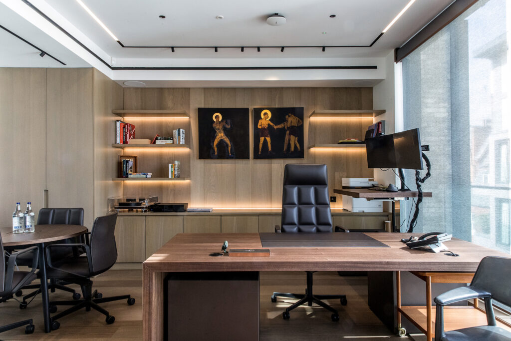
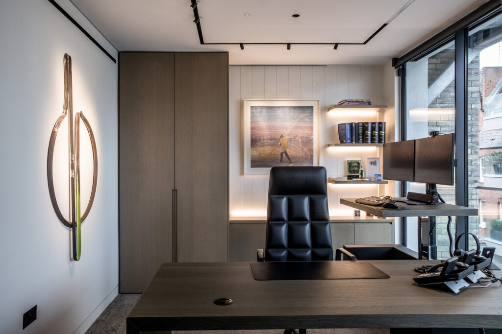
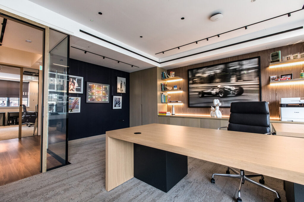
Revisting Catherine Place over 10 years on, the client brief was to revitalise and bring the whole space up to date!
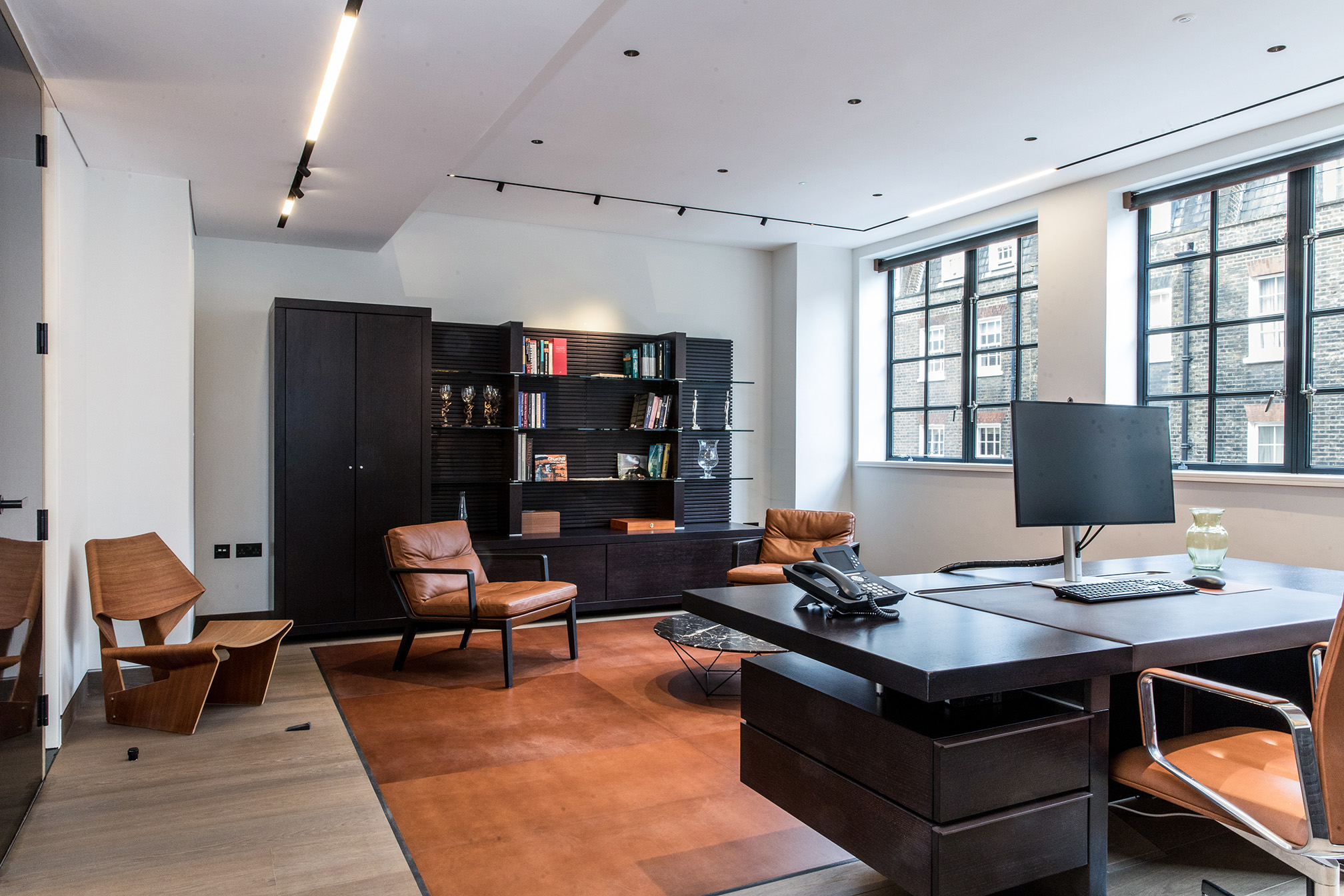
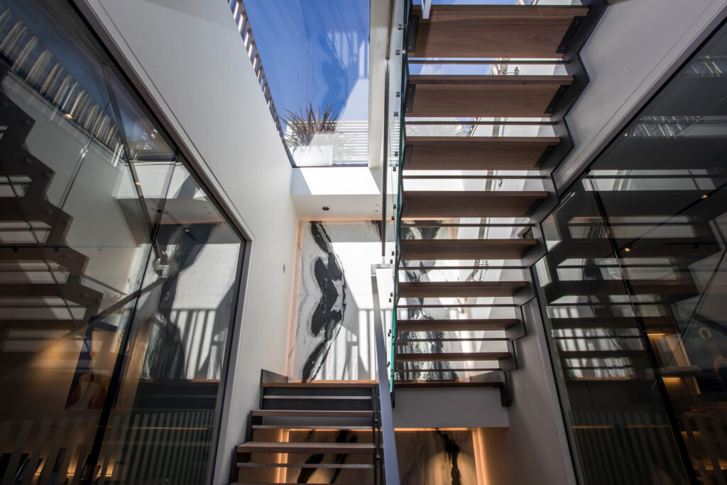
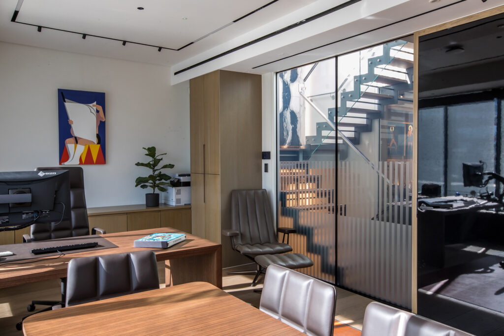
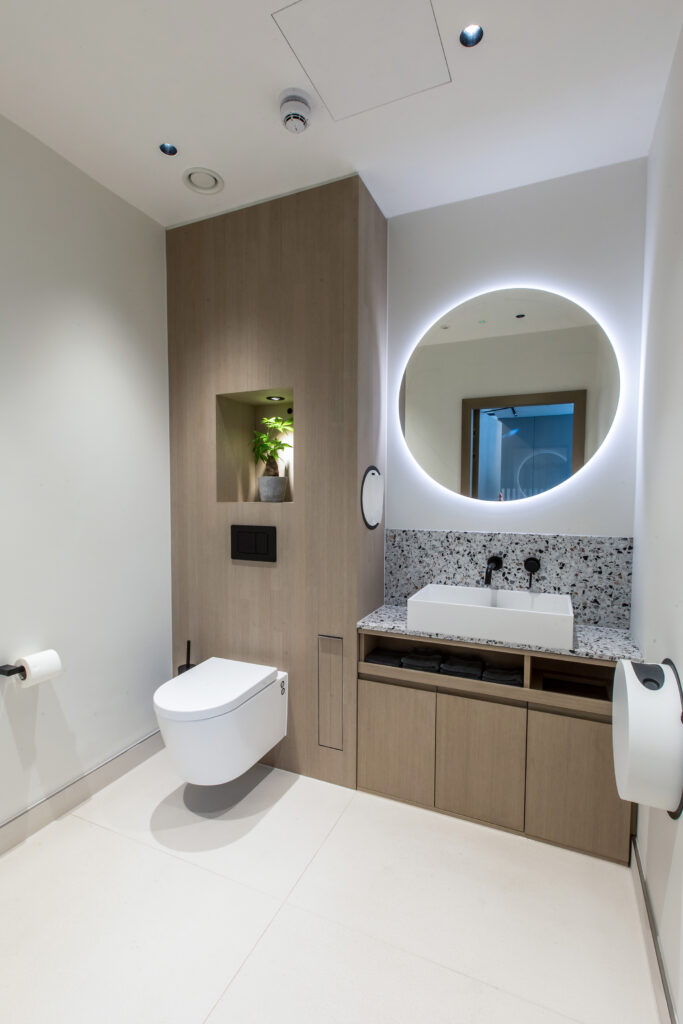
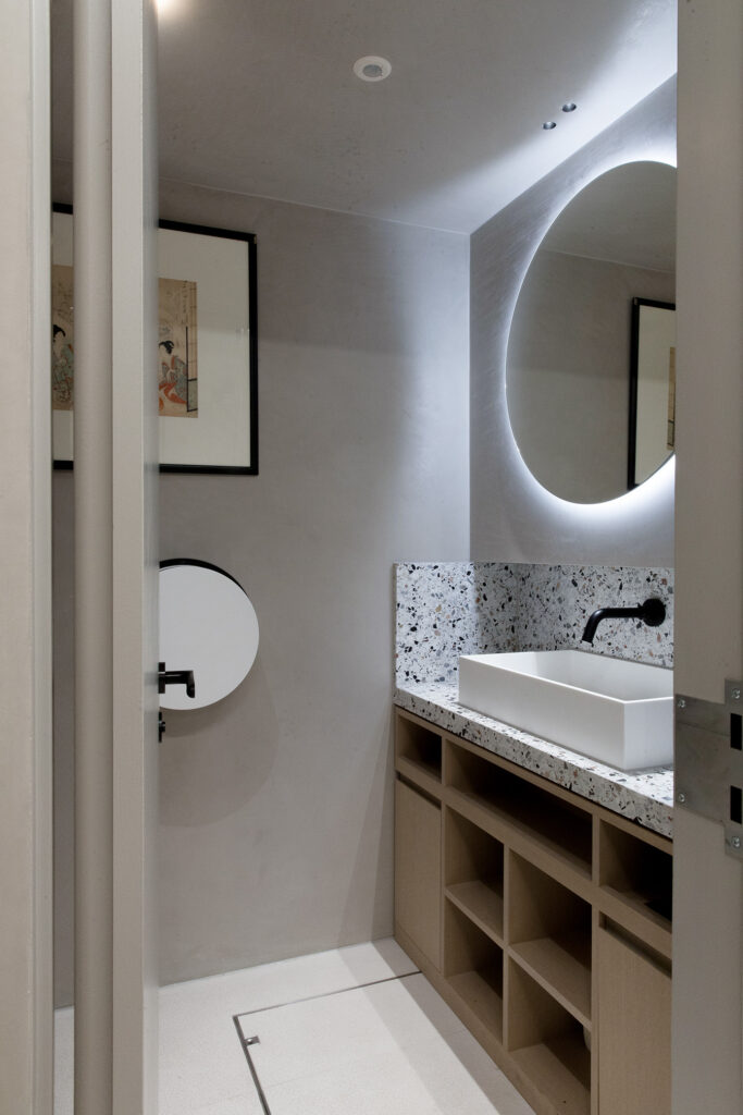
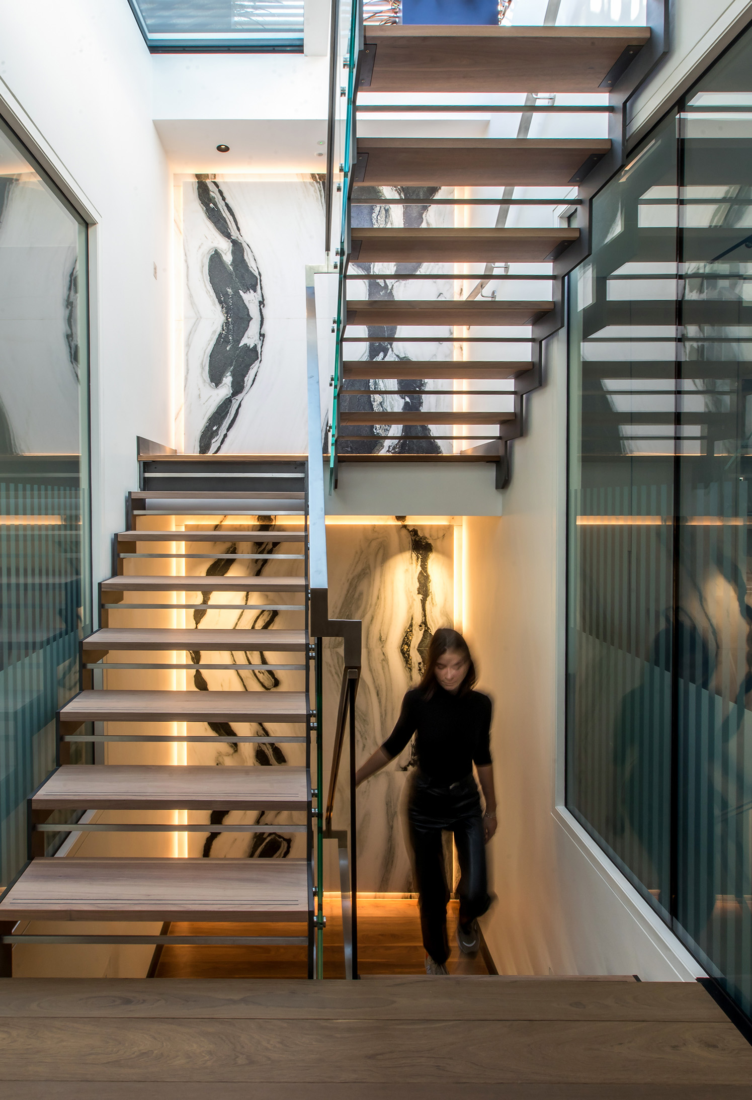
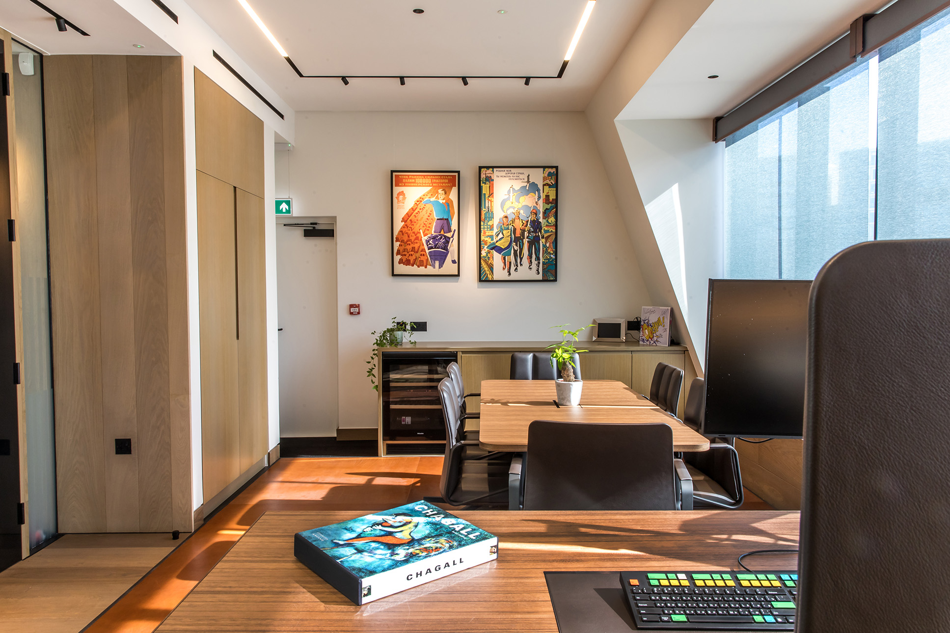
When a valued client is looking to refresh their space, we take it as an opportunity to redefine excellence. The challenge? Examining our own work critically. For the newest iteration of Catherine place we sought to preserve the core staircase. A Key feature in the last refurb, while introducing fresh elements. We used some striking stone elements and timber flooring to bring the interiors up to date. As well as having some fun with luxury surfaces such as leather flooring! As always we sought to bring even more light into the building with some ambitious engineering.
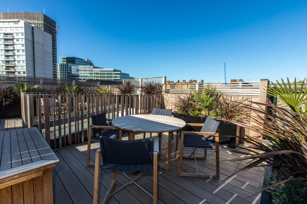
We brought the Mansard roof even higher up to allow for tall windows in all of the upper offices. Also working with a planning consultant to ensure that we were able to develop a more extensive rooftop garden. This also led to redeveloping the skylight. Our team worked closely with a glazer to develop the largest piece that we could have that wouldn’t risk smashing. This was incredibly fine work, with every mm being managed to ensure a perfect fit.
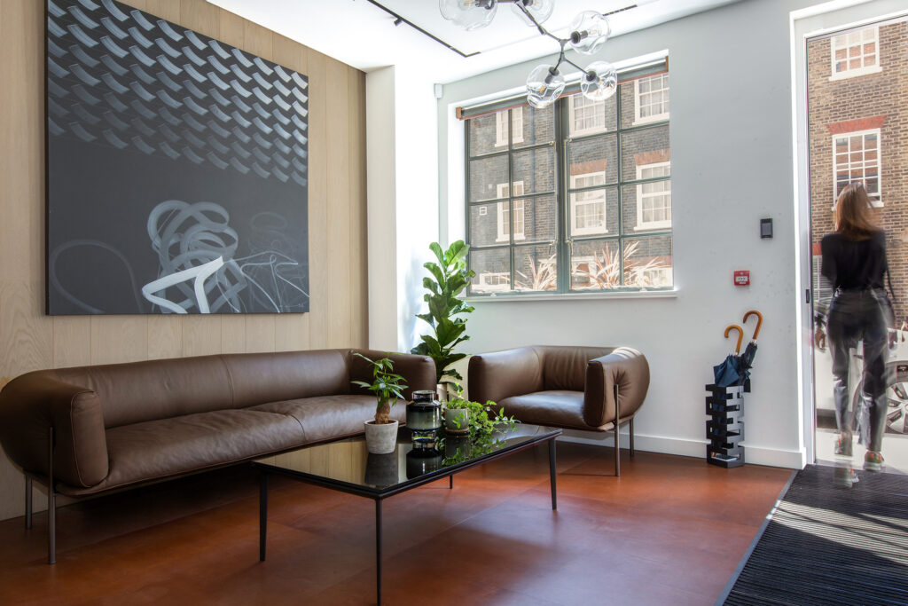
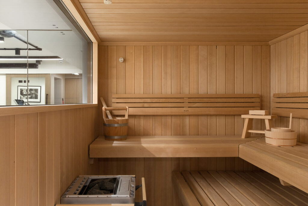
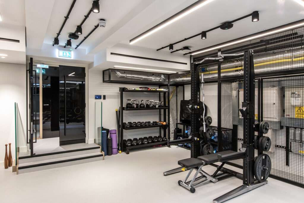
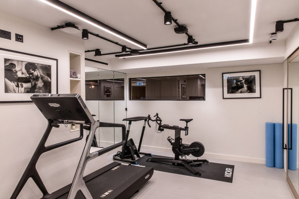
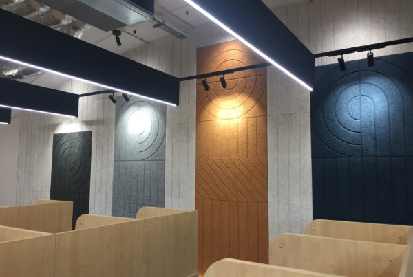
As the project unfolded, our attention turned to versatile functionality. Every angle, every corner was considered. The interplay of light and space emerged as a pivotal design element, radiating a sense of well-being and helping zone different areas for different uses. Acoustic panels enveloped the entrance, elegantly taming sound. While in the basement we reworked the previous gym space to incorporate a full sauna. Eventually creating a custom front door to welcome guests and clients into the office space.
Throughout this transformative process, we remained in synergy with our client's vision. Our 14-year journey with this client has been a testament to the harmonious collaboration that defines Annette Peters Design. The result? A space that not only meets expectations but redefines them.
See more of our projects
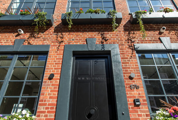
'.get_the_title().'
Victoria – High-end office
Revisting Catherine Place over 10 years on, the client brief was to revitalise and bring the whole space up to date!
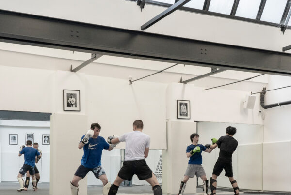
'.get_the_title().'
Judo Academy
Our team helped source, build and fit out this complex multi-use space. Incorporating gym, leisure, judo and mixed use space all under one roof.
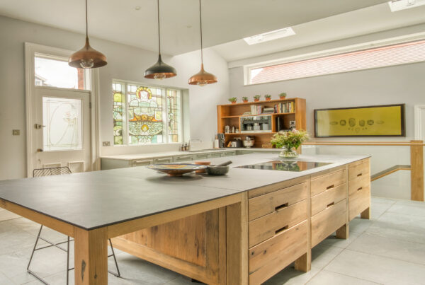
'.get_the_title().'
Richmond residential
A stunning residential home that needed the flow of space reprioritised to suit the families changing needs, as well as an interior overhaul.
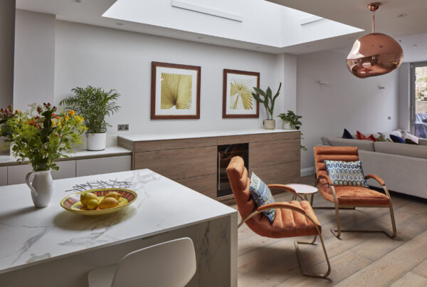
'.get_the_title().'
Wimbledon Residential
A residential redesign for this London home. We planned and executed a transformative refurbishment encouraging light and elegance in this residential home.
'.get_the_title().'
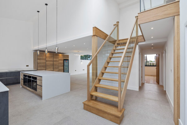
Cobham Barn Conversion
This project involves converting an old agricultural storage barn into two semi-detached houses in a rural setting.
'.get_the_title().'
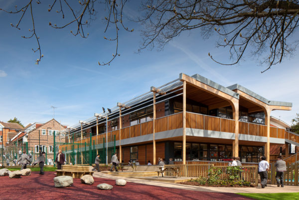
Rokeby School
Designing to help this school embody innovation and sustainability, creating inspiring educational spaces that harmonize with their surroundings while prioritizing student well-being and academic excellence.
'.get_the_title().'
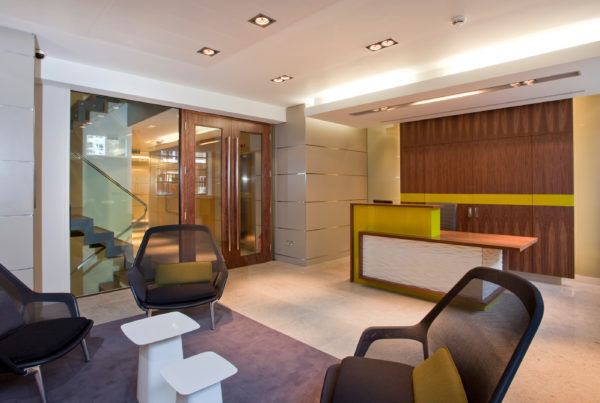
Victoria high-end office – 2009
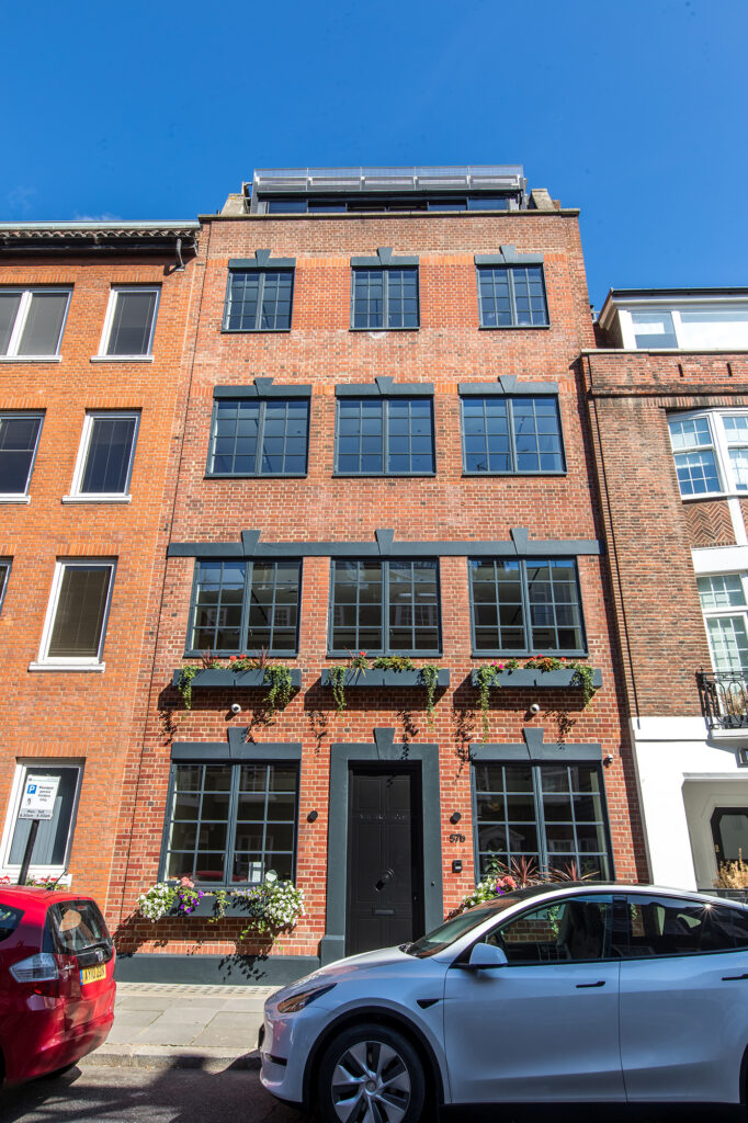
Revitalising a dated office building by optimising natural light, modernising the exterior with black-framed windows, and collaboratively crafting an elegant interior with unique features, creating a harmonious blend of historical charm and contemporary functionality.
'.get_the_title().'
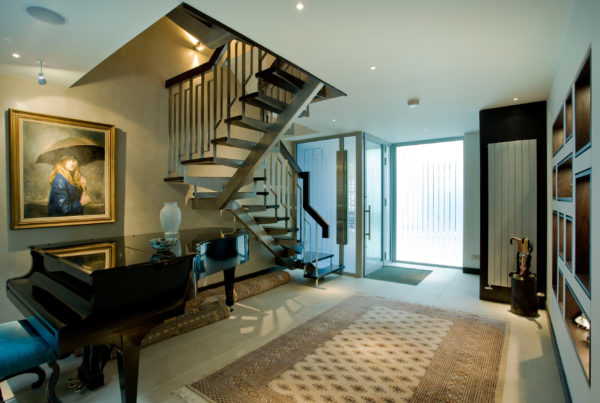
The Blue House
Our transformation of the Blue House seamlessly marries cherished history with contemporary functionality, creating a vibrant living space that pays homage to the past while embracing the future.
'.get_the_title().'
Cardinal Wiseman
Our design team rejuvenated Cardinal Wiseman School's sixth form center by seamlessly merging innovative design, functional spaces, and thematic elements, resulting in an inspiring educational environment that transcends its original purpose.
'.get_the_title().'
Dora Road
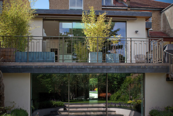
For this project we masterfully revitalised a dated 2006 residence atop a steep hill, creating an open and light-filled lower ground floor with seamless indoor-outdoor connections.


